Modern life is undoubtedly full of data and means to generate, present, receive or transfer it. It also implies that it has become much more difficult to filter useful and important pieces of information out of general “ocean” – distinguish significant from insignificant.
Interactive Data vizualisations has been separated into distinct activity in early 2000’s, about 10-15 years ago. Very soon a whole industry appeared around it and is still evolving. When dealing with large amounts of data, visual presentation is the only possible way to transform information into knowledge. So introduction of such notions as data visualization and interactive data storytelling was a matter of time. Let’s discover them…
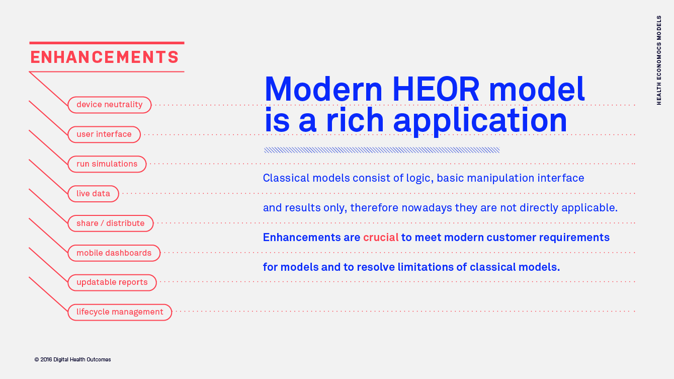
Unlike regular static infographics, dashboards and standard reports, Interactive Data Visualizations allow to “slice and dice” the data, drill down and around, interact with data, iteratively ask better questions and ultimately find answers
For example, it takes much more time to find a particular number in an array of other numbers than to find a red object in an array of blue objects. So it becomes much easier to find regularities and emphasize important patterns, as well as distinguish connections between data by interacting with it. Thus, interactive data visualizations simplify data interpretation, and therefore improve and accelerate business decision making. It also helps a lot to draw right conclusions and make correct predictions and forecasts.
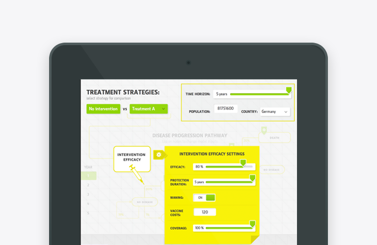
Interactive Data Storytelling wraps the data presentation process into narrative and friendly form, and instead of facing chunks of data (even if visually empowered by shapes and colors) target audience follows animated story controlled by the user. Often it gradually presents all the data in a linear fashion from a presenter standpoint, but also allows to explore detailed data, validate key findings and interact with input parameters to obtain personalised results, from user’s own perspective.
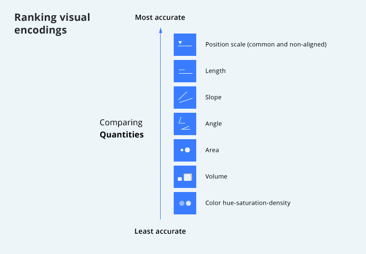
Proper visualization doesn’t need to be functionally too complex or visually too beautiful to achieve its main goal: to communicate information to the user. Jeffrey Heer in his StrataHadoop 2015 presentation named “The Future of Data Visualization” ranks visual encodings:
Data processing and visualizations became a priority for many companies, especially in the era of big data. Companies from pharmaceutical, telecom, energy and other sectors create separate data processing/visualization departments or engage with external consulting agencies and dataviz experts to take evidence based and data driven decisions. It is also worth mentioning that finding out certain fact or regularity in myriads of corporate data is often not enough by itself – it is also important (and usually much harder) to convince your colleagues, clients and partners that your discovery is true and relevant to business. And again that’s when proper visual data presentation is of great help. In this case focused interactive infographics or videos might be the best form to communicate value and convince internal stakeholders.
Personalised user interfaces combined with interactive data visualizations and data storytelling modes improve the level of information perception and content engagement in modern mobile/web environment. Endless data visualization possibilities, availability of powerful third party tools/libraries and affordability of custom software engineering drive the growth and further expansion of this exiting interactive data visualization approaches globally.