How interactive data visualizations change communication of health data
Presentation of health data is undergoing a big change, one that will influence not only how payers and providers make their decisions but also how pharma, medical devices and in-vitro diagnostics companies will interact with external world. Five years ago, interactive health data visualisations usually took a form of simple dashboards with animated charts and accompanying messages.
Nowadays evolutions of modern web capabilities and emergence of the powerful data visualisation tools open almost unlimited possibilities to visualise data and tell the complex story in an easy to digest manner.
The environment has changed. The days of desktop dominance are over. For the recent years mobile platforms overtake the lead in total activity for an astounding 60 percent of digital media time spent in the U.S. Moreover, social media has transformed the way we consume content, and healthcare content is not an exclusion. On sites such as Facebook, Twitter and LinkedIn we scroll through streams of content. This has led in turn to the increase in “scrollytelling” — type of storytelling that utilizes scroll as accustomed experience to reveal data visualisations and accompanying contextual explanations.
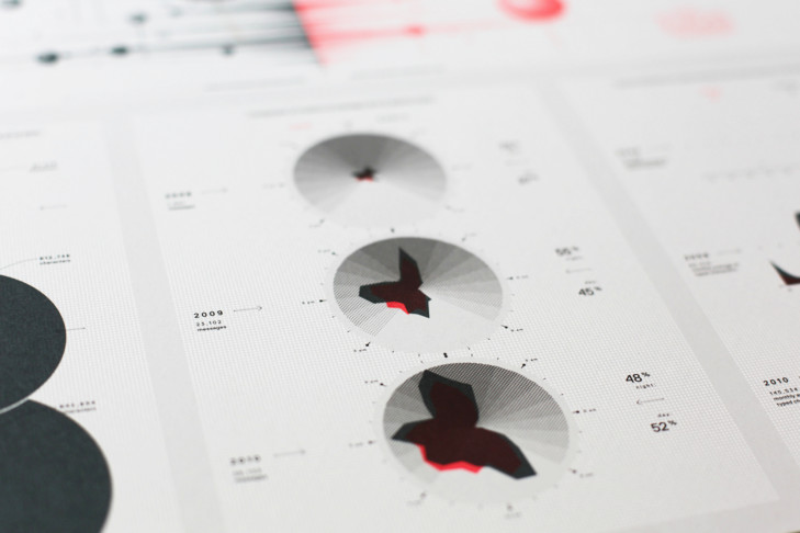
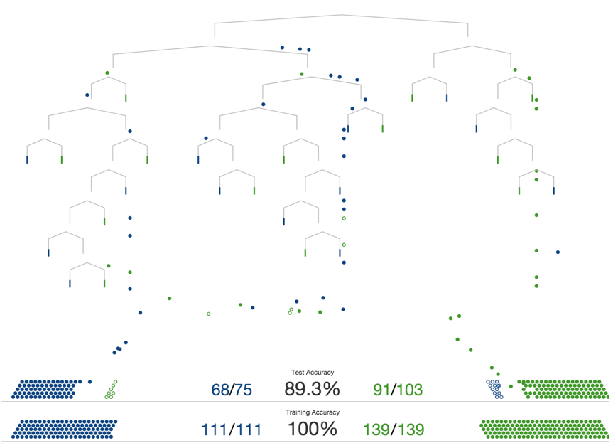
Example 1. Scrollytelling
An impressive example of how scrollytelling technique is applied to explain complex concepts is R2D3’s Introduction to Machine Learning.
When to use ?
It’s better to go with this type of visualisation in case of a linear story, having no need to drill down into any particular section of the content with additional interactions for data exploration (hovers, clicks, etc.). It is crucial to have an ability to combine different value messages around the same or similar graphics structures (e.g. a charts animations revealing trends or connections between different data points ). The scroll allows to easily navigate story back and forth alongside with smooth unobtrusive graphic transition. This makes a strong emphasis on a story flow linearity, encouraging user to quickly grasp logic of how value messages interconnected.
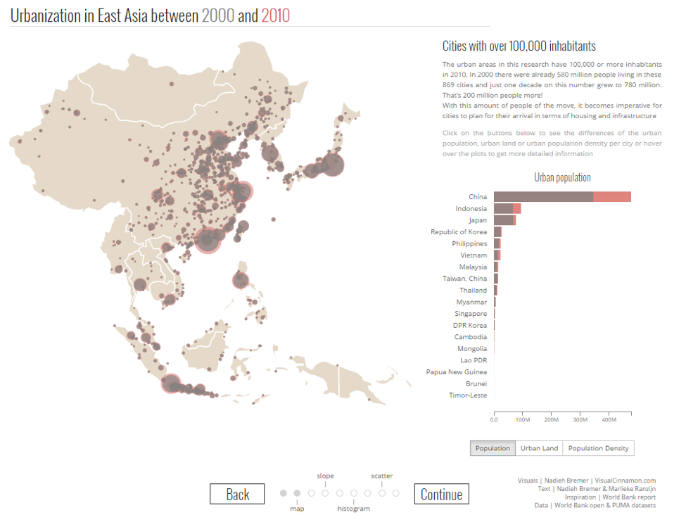
Example 2. Linear story combined with user explorations
“Urbanization in Eastern Asia” example successfully integrates story narration from a presenter’s standpoint with the possibility to explore data and find interpretation from user’s own perspective. It combines interactive video and data exploration user modes. Interactive video mode summarizes key concepts and data patterns. When short video section ends, the user automatically enters data exploration mode which allows to drill down into specific data points and reveal different relations between them using various filters and mouseover events.
When to use ?
This approach is useful when it comes to provision of both generic and tailored results to end users. Users appreciate the opportunity to customise and visualise data to make it relevant to their viewpoint, geographical position, role, etc. From a presenter’s standpoint the story needs to be told in a particular fashion, so often linear way is the only way. On the other hand the story becomes trustworthy when users can interact with it, explore all aspects and make it tailored. The linear story combined with user explorations mode allows for both of these to be integrated in a single app. It is also good to use this approach when the story consists of several interconnected concepts each having it’s own visual representation.
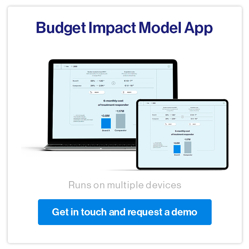
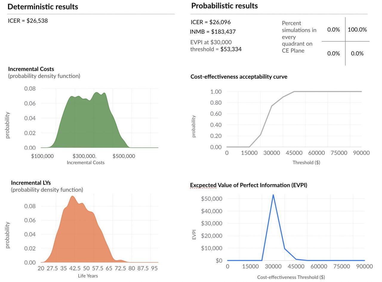
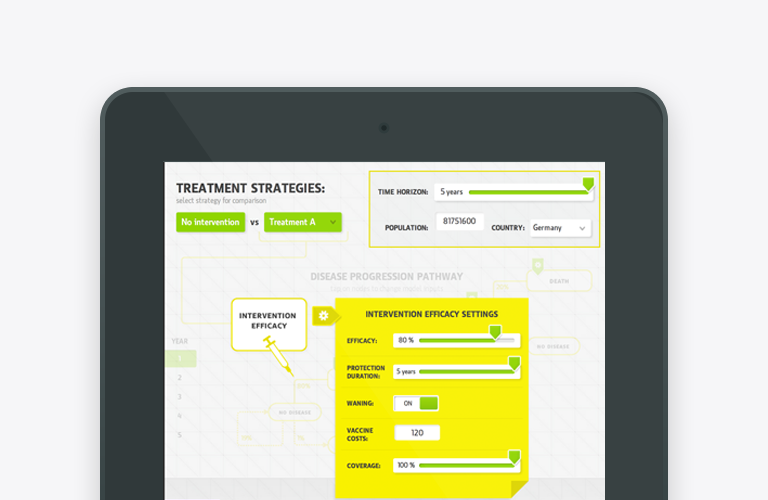
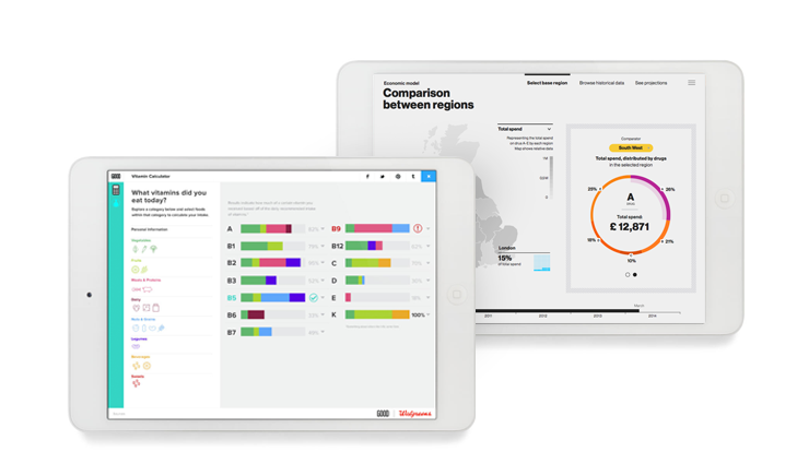
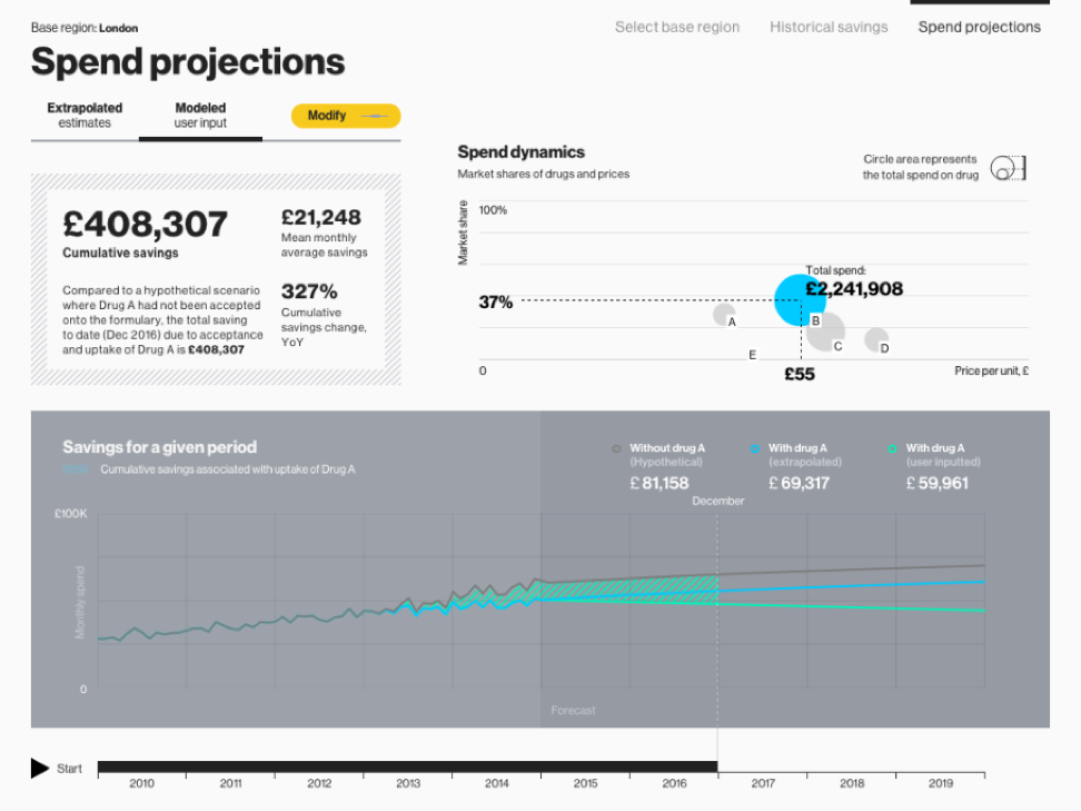
Example 3. Interactive health economics model – eModel
Digital Health Outcomes together with Adelphi Values developed an example of Budget Impact eModel that integrates “play data” mode allowing to visualise spending change dynamics and detailed data at every time point of interest, over a 10 year time horizon. This interactive health economics budget impact model provides drugs spending data, and analytics for payers to make their decisions, based on the similar patterns in other regions in the UK. User are provided with the ability to simulate various scenarios and enter their own commercial assumptions to obtain personalised results relevant to an individual payer setting.
When to use ?
In case users need to manipulate multiple different input parameters to make results as precise and tailored as possible, interactive web based models – eModels provide powerful user interface to so in real time and in an engaging manner. eModels are used when powerful data communication layer and easy to use model manipulation interface are needed to engage with payers and healthcare providers.
Example 4. Interactive infographics, wrapped into a consistent story
There’s no doubt that the infographics evolved drastically since the late 2000s (time when internet was overcrowded with quirky, experimental infographics) and now transformed into something more mature, corporate, all-sufficient and goal driven. The distinctive features of such “new infographics” (emerging trend is to call it “web graphics”) are: clear information presentation, intuitive interactivity and subtle animations. These features encourage users to get deeper into information and receive structured knowledge in exchange.
A good example of the interactive infographics is Vitamin Atlas created by Hyperakt studio. It’s a fun and informative tool designed to help people shed light on the correlations between common foods and vitamins. Tool guides users to understand the complex interactions that keep people healthy.
Another distinguishing example that is keen to deliver classical editorial experience empowered with interactive visualizations is Internet of things interactive dataviz tour. This example incorporates a few popular D3.js widgets (Zoomable Circle Packing etc.) to fluently convey the technology basics.
When to use ?
Presentation of single complex concept data as a rich data visualization. Suits well for presentation of large arrays of data and when the story is not linear. Great to use when the content is separated into independent sections and it is not so important for the user to explore all sections.
Take aways…
All the approaches mentioned above include some or all of the following principles:
- Bring data to the user in a form of an engaging story
- Allow the user to control a story flow and explore data with web interactions
- Include UI elements which enable easy data filters and highlights, as opposed to static visualisations, presenting only single dimension and viewpoint
- Allow to change input parameters on the go and easily track the resulting changes
- Customise different scenarios depending on user presets: regions, countries, products, indexes – suchwise provide the users only with the information which is important for them
- Enable user friendly web experience across all devices with HTML5/JS/CSS.
- Focused on modern visual language guidelines (Material Design, IBM Design language, etc. ) to make story goals conceivable for a vast majority of users.
Combined together these simple tips greatly improve user data exploration experience and relevance of delivered information. After migration of data visualizations to into web/mobile environment, they provide much wider capabilities for sharing, updating, analytics and customisations making data & information relevant to the user’s own perspective. Nowadays data can always be live and up to date. Wide adoption of cloud and database capabilities enable automated data fetching from the variety of sources, fast data processing and effective data visualisations with frameworks like D3.js.